When working with pen and ink, you’re not just creating lines on paper – you’re building depth, texture, and emotion. A well-crafted pen and ink drawing can transport viewers to another world, inviting them to explore every subtle nuance. However, achieving this level of mastery requires patience, practice, and a solid understanding of the techniques involved.
Mastering basic strokes, from hatching to cross-hatching, is essential for creating convincing shading and value in your drawings. Yet, many artists struggle with transitioning from simple exercises to more complex pieces that showcase their skills. This article aims to bridge this gap by providing comprehensive guidance on pen and ink drawing techniques, from fundamental principles to advanced methods for achieving realistic shading and value creation through hands-on practice and expert instruction. By the end of this guide, you’ll have a solid foundation in creating engaging, detailed drawings that captivate your audience.
Getting Started with Pen and Ink
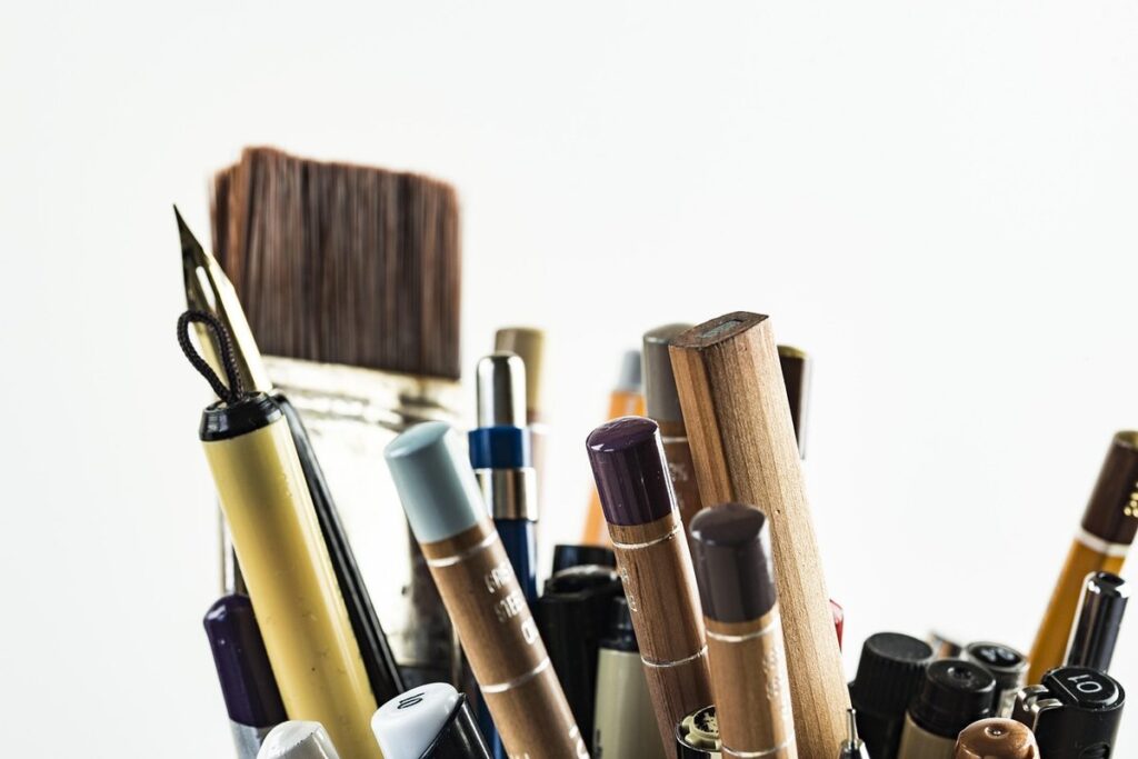
To create stunning pen and ink drawings, it all starts with selecting the right tools and understanding some fundamental techniques to get you going. Let’s begin with the basics of choosing a nib and ink that suit your style.
Choosing the Right Tools
When selecting a pen for pen and ink drawings, consider the type of nib you need. Dip pens have flexible metal nibs that can produce varying line widths, while fountain pens offer precision and consistency with their interchangeable tips. Brush pens combine the expressiveness of a brush with the control of a pen. Choose one that suits your drawing style.
Ink characteristics are also crucial. Waterproof inks prevent smudging and bleeding through paper, making them ideal for artworks intended to be handled or displayed in humid environments. Archival-quality inks ensure that your artwork will last for generations without fading or degrading. Consider the color range as well – do you prefer a single color with varying shades, or a set of vibrant colors?
When it comes to paper, hot press paper is smooth and even, making it ideal for detailed work and fine lines. Cold press paper has a textured surface that’s perfect for creating expressive brushstrokes and gestural drawings. Vellum offers a luxurious, translucent finish but can be fragile. Choose a paper type based on your desired effect – do you want crisp precision or organic expressiveness?
Basic Drawing Techniques
To create effective pen and ink artwork, it’s essential to master basic drawing techniques. Start by learning various strokes, such as lines, curves, and hatching. Practice these strokes on a separate sheet of paper until you feel comfortable with the tools and their capabilities.
Lines can be straight or curved, varying in width from fine details to bold strokes. Mastering different line weights is crucial for creating depth and dimension in your artwork. For example, use thicker lines for outlines and thin lines for details.
Understanding proportion and perspective is also vital when drawing with pen and ink. To achieve accurate proportions, use a ruler or other straightedge to draw guidelines on your paper. Perspective helps create the illusion of three-dimensions by using vanishing points to guide the placement of objects in your artwork.
Creating simple shapes like spheres, cylinders, and boxes can help you develop your drawing skills. Practice rendering these shapes from different angles and perspectives to improve your understanding of form and structure. By mastering these fundamental techniques, you’ll be well-equipped to tackle more complex subjects and create engaging pen and ink artwork.
Mastering Line Quality and Expression
As you refine your pen skills, mastering line quality and expression is crucial for adding depth and emotion to your drawings. This is where subtle variations in line weight and texture come into play.
Creating Varying Line Weights
To create varying line weights, you need to experiment with different pens, tools, and techniques. One of the simplest ways to achieve a range of line thicknesses is by using multiple pens or nibs of varying widths. For example, you can use a fine-tip pen for details and a broader pen for background elements.
However, this approach has its limitations – it’s often impractical to switch between pens mid-drawing, especially if you’re working on a large piece. A more flexible solution is to experiment with different line weights using the same pen. By applying varying amounts of pressure to your pen, you can create thicker or thinner lines.
Another technique for creating varying line weights is through hatching patterns. For instance, closely spaced parallel hatches can create a thick, textured effect, while widely spaced ones can produce a thin, delicate look. Experimenting with different hatching patterns and pressures will help you develop your own unique range of line weights.
Expressive Mark-Making
Expressive mark-making is a vital aspect of creating engaging pen and ink drawings. It involves capturing the spontaneity and energy of the human experience through various techniques. Gestural drawing, for instance, involves loose, expressive lines that convey movement and emotion. This can be achieved by varying line weights, using different tools, or experimenting with different angles.
Abstract expressionism is another technique that allows you to tap into your creative subconscious, creating unique marks that reflect your inner world. Try applying ink directly from the bottle onto paper, allowing it to flow in unpredictable ways. You might also use a range of pens and pencils with varying line widths and textures to create layered, expressive marks.
To incorporate loose sketching into your practice, focus on capturing the essence rather than the detail. Start by lightly sketching the overall shape and pose of your subject, then build up layers of lines and details in a spontaneous, gestural manner. Practice these techniques regularly to develop your skills and discover new ways of expressing yourself through pen and ink.
Understanding Ink Flow and Consistency
To create stunning pen and ink drawings, it’s crucial to master the delicate balance of ink flow and consistency. Achieving smooth lines and rich details relies on a solid understanding of these fundamental principles.
Achieving Smooth Lines
Maintaining a consistent hand speed is crucial for achieving smooth lines. To achieve this, practice drawing at a steady pace, avoiding sudden jerks or acceleration. This can be done by creating simple gesture drawings of basic shapes and lines, gradually increasing the complexity as you become more comfortable with your hand’s movement.
Gentle pressure on the pen tip also contributes to smooth lines. Apply light pressure for fine details and thicker lines for areas that require more ink flow. Be aware that excessive pressure can lead to uneven line widths or even skip marks.
The angle of your pen is another factor to consider when aiming for smooth lines. Experiment with varying angles to find what works best for you, as this will depend on the type of pen and paper you’re using. Some pens perform better at specific angles due to their tip design.
Adjusting the ink viscosity or flow rate can also affect line quality. Using a thicker ink can produce smoother lines but may compromise on detail. Conversely, thinner inks might provide more precision but risk showing up feathering or bleed-through on certain papers.
Managing Ink Bleed-Through and Feathering
Ink bleed-through occurs when ink seeps through to the other side of the paper, creating a faint outline of your drawing. Feathering is another common issue, where the edges of ink become soft and blurry due to the paper’s texture or quality. To minimize these effects while maintaining artistic expression, choose papers with a high rag content and a smooth finish. Look for papers labeled as “hot press” or “smooth,” as they are less prone to bleeding.
When using a dip pen or brush, experiment with different ink consistencies by adding a few drops of water or solvent to achieve the right balance between flow and control. A too-thin ink can lead to excessive bleeding, while a too-thick one may cause hard lines and scratches on the paper’s surface. Avoid over-inking your pages, as this can exacerbate bleed-through.
In some cases, you might need to adjust your drawing style or technique to accommodate the limitations of your paper choice. For example, if you’re working with a particularly absorbent paper, try using shorter strokes or building up layers of ink gradually to prevent excessive bleeding.
Shading and Value in Pen and Ink
Effective shading and value are crucial elements that can elevate your pen and ink drawings from simple line work to rich, dimensional art. This section will explore techniques for mastering these essential skills.
Creating Gradations of Value
To create smooth transitions between values in a pen and ink drawing, you can use hatching patterns. Hatching involves creating closely spaced parallel lines that follow the contours of the subject. By varying the direction and pressure of these lines, you can achieve different shades of gray and depth. For example, by using short, soft strokes for light areas and longer, more deliberate strokes for dark areas, you can create a convincing transition between values.
Another technique is cross-hatching, where multiple layers of hatching patterns are overlaid at different angles to build up depth and value. This can be achieved with a range of tools, from fine dip pens to flexible nibs. Experimenting with different tool pressures and strokes will help you achieve the desired effect.
For more subtle transitions between values, consider using stippling, which involves creating an image using small dots. By varying the density of these dots, you can create a wide range of tonal values. This technique requires patience and attention to detail but can produce highly nuanced results.
Mastering Chiaroscuro and Atmospheric Perspective
To master chiaroscuro and atmospheric perspective in pen and ink drawings, you need to understand how to manipulate light and dark areas to create a sense of depth. Chiaroscuro involves strong contrasts between light and dark areas, which can be achieved by using different line weights, hatching patterns, or cross-hatching techniques. For example, a simple exercise is to draw a basic shape, like a cylinder or sphere, using only light and shadow to define its form.
Atmospheric perspective, on the other hand, relies on color and contrast to create an illusion of distance. Warm colors tend to advance while cool colors recede. You can apply this principle by using different line weights or hatching patterns for objects in the foreground and background. For instance, a subtle gradient of darkening values can suggest depth in a landscape.
To practice these techniques, try drawing a simple still life with strong contrasts between light and dark areas. Use a range of line weights to create volume and interest. Alternatively, draw a landscape with a clear sense of atmosphere – warm colors for the foreground and cool colors for the background will help create an illusion of depth.
Common Mistakes and Troubleshooting
Don’t let frustrating errors ruin your beautiful pen and ink drawings – we’ll tackle common mistakes and share expert tips to get you back on track.
Overcoming Frustrating Drawings
When working on a pen and ink drawing, it’s common to encounter frustrating results that don’t live up to your expectations. Uneven lines, lack of detail, or an unbalanced composition can be discouraging. To identify these mistakes, take a step back and evaluate your work critically.
Start by examining the line quality: are there areas where the lines are too heavy or too light? Check for consistency in line weight, and consider using a range of nib sizes to create varying weights. Look at the detail level: have you included sufficient texture, pattern, or fine details to add depth?
Ink flow issues can also hinder your progress. If ink is bleeding through or feathering excessively, it may be due to poor paper quality or insufficient drying time between layers. Experiment with different papers and techniques to achieve the desired effect.
To troubleshoot composition problems, consider the rule of thirds: divide your drawing into thirds both horizontally and vertically, placing important elements along these lines for balance. Pay attention to negative space, too – don’t forget that empty areas can be just as effective at guiding the viewer’s eye as filled ones.
If you’re struggling with ink flow or paper quality, try switching to a different brand or type of paper altogether.
Refining Your Skills Through Practice
To refine your skills through practice, it’s essential to establish a regular routine. Set achievable goals for each drawing session, whether it’s mastering a new line quality or experimenting with a specific technique. Break down larger objectives into smaller, manageable tasks to maintain momentum and motivation.
Create a habit of tracking your progress by maintaining a sketchbook or journal dedicated to pen and ink drawings. Regularly review your work to identify areas that require improvement and celebrate successes. This self-assessment will help you pinpoint what’s working and what needs attention.
Experiment with different techniques, styles, and subjects to avoid plateaus. Don’t be afraid to venture outside your comfort zone – it’s often the most challenging drawings that lead to significant growth. When faced with a difficult piece, revisit previous work and identify key differences in approach or execution.
To build confidence, focus on progress rather than perfection. Acknowledge small victories, even if they seem insignificant at first. As you accumulate more experience and successes, your skills will improve, and you’ll develop a deeper understanding of how to manipulate pen and ink to achieve the desired effect.
Advanced Techniques and Applications
Now that you’ve mastered the basics, it’s time to take your pen and ink drawings to the next level by exploring more complex techniques and applying them to various subjects.
Incorporating Watercolor and Mixed Media
When combining pen and ink with watercolor or mixed media, you’re not limited to traditional paper. Explore the possibilities of incorporating other surfaces, such as Yupo paper, which offers a unique, non-porous texture that resists bleeding. You can also experiment with different types of inks, like iron gall or sepia, for distinct color profiles and blending capabilities.
To achieve layered artworks, consider using transparent washes to build up values and textures over dry pen lines. This technique allows you to create nuanced depth without sacrificing the crispness of your ink work. For added dimension, incorporate materials like pastels, charcoal, or even fabric scraps into your mixed media compositions.
Think about how different paper types can influence your artwork’s overall aesthetic. For example, using a rough-textured paper can add organic, expressive qualities to your pen and ink lines, while a smooth surface will produce more precise results. By exploring these variables, you’ll discover new ways to manipulate the boundaries between pen and ink, watercolor, and mixed media.
Tackling Complex Subjects and Portraits
When tackling complex subjects like portraits, animals, or landscapes with pen and ink, it’s essential to break them down into manageable parts. Start by identifying key features such as facial structures, muscle definition, or architectural details. Then, focus on one area at a time, building up layers of texture and detail.
For example, when drawing a portrait, begin with the eyes – their shape, size, and placement. Next, move on to the nose, mouth, and jawline. Gradually build up facial features, paying attention to proportions, contours, and expressions. To capture nuanced expressions, study the subject’s emotions and experiment with different line weights and hatching patterns.
When drawing animals or landscapes, consider their anatomy, movement, and texture. Break down complex forms into simpler shapes, using reference images to inform your work. For instance, when drawing a cat’s fur, focus on creating smooth transitions between individual hairs, using gentle curves and soft lines. Remember that complexity is not just about rendering every detail – it’s also about conveying the essence of the subject through selective focus and expressive mark-making.
Tips for Displaying and Preserving Your Artwork
Once you’ve completed your pen and ink drawing, it’s essential to display and preserve it properly to maintain its beauty and value over time. Proper care will ensure your artwork remains a cherished possession for years to come.
Preparing Your Work for Exhibition
When preparing your pen and ink drawings for exhibition, careful consideration should be given to framing, mounting, and labeling techniques. A sturdy frame with UV-filtering glass or acrylic will protect your artwork from fading caused by sunlight exposure. However, avoid using acidic or lignin-based materials in the frame’s construction, as these can damage your drawing over time.
Mounting options include traditional framing methods or more innovative approaches like float framing or double matting. Float framing involves placing the drawing directly onto a backing board without glazing, while double matting adds an extra layer of protection and aesthetic appeal with two mats of varying widths. Labeling is also crucial, providing essential information about the artwork’s title, medium, size, and date created.
To ensure long-term preservation, consider consulting a professional conservator or frame maker who has experience working with ink drawings. They can advise on specialized conservation methods, such as deacidification or stabilization treatments, to prevent damage from aging materials. Keep in mind that some exhibition spaces may have specific requirements for framing and mounting, so be sure to check with the venue before preparing your artwork.
Digital Tools for Enhancing and Sharing Your Work
When it comes to sharing your pen and ink artwork with others, digital tools can be a game-changer. You can use image editing software like Adobe Photoshop or Illustrator to enhance your work, making it look more polished and refined. These programs allow you to adjust the brightness, contrast, and color balance of your artwork, helping to bring out the subtleties in your ink lines.
Digital coloring apps like Procreate or Autodesk Sketchbook can also be used to add color to your black-and-white pen and ink drawings. These apps offer a range of brushes and tools that mimic traditional drawing techniques, allowing you to seamlessly integrate digital colors into your artwork. Social media platforms like Instagram, Behance, and DeviantArt are perfect for showcasing your artwork, with features like hashtags, tagging, and commenting making it easy to share and engage with others.
If you want to take your sharing experience to the next level, consider using online portfolio platforms like Wix or Squarespace. These websites offer customizable templates and design tools that enable you to create a stunning digital showcase for your artwork. You can also use them to connect with potential clients or commissions, making it easier to turn your passion into a career.
Frequently Asked Questions
Can I use pen and ink to create digital artwork too?
Yes, many artists scan or photograph their pen and ink drawings and edit them digitally using software like Adobe Photoshop. This can enhance colors, textures, or even combine multiple artworks into a single piece.
How long does it take for an artist to develop mastery with pen and ink techniques?
Developing mastery in any art form takes time and consistent practice. With regular drawing sessions and experimentation, you can improve your skills within 6-12 months. However, true mastery may take years of dedication and continuous learning.
What if I’m struggling with uneven line weights or inconsistent ink flow? Are there any quick fixes?
Yes, a few common issues have quick solutions: try adjusting the angle of your pen, using different paper types, or changing the type of ink you’re using. Experimenting with varying line techniques can also help develop muscle memory and improve control over your lines.
Can I use mixed media like watercolor or pastels alongside pen and ink, or will it ruin the artwork?
Mixed media can be a great way to add texture and depth to your artworks. When combining pen and ink with other mediums, experiment with different paper types and techniques to ensure that the additional materials complement rather than overwhelm the pen work.
What’s the best way to display and preserve my pen and ink artworks for long-term conservation?
To prepare your artwork for exhibition or preservation, use acid-free mats and frames specifically designed for art conservation. You can also consider consulting a professional conservator if you’re unsure about handling sensitive materials.